See, digest, act
Position
Explore how a new dashboard might look and work for our existing clients and new ones. Think about the issues at hand and, be cognisant of how our technology and stakeholders are involved in maintaining the dashboard and our wide user base
Problem
New and existing users struggled to use/didn’t use the existing dashboard. It had only the basic amount of personalisation, didn’t know its use base, didn’t offer insights or suggestions and had very little in the way of notifications
Possibilities
Show useful information that a user can act upon
Make complicated information easy to understand
Help users analyse and present key insights
UI Design Principles
Before putting paper to paper as it were, we established what a dashboard is and, what it needs to do
Page narrative
Speaking to Stakeholders and Research, we identified how the page should be structured, which meant re-working existing UX and filling in missing user-needs.
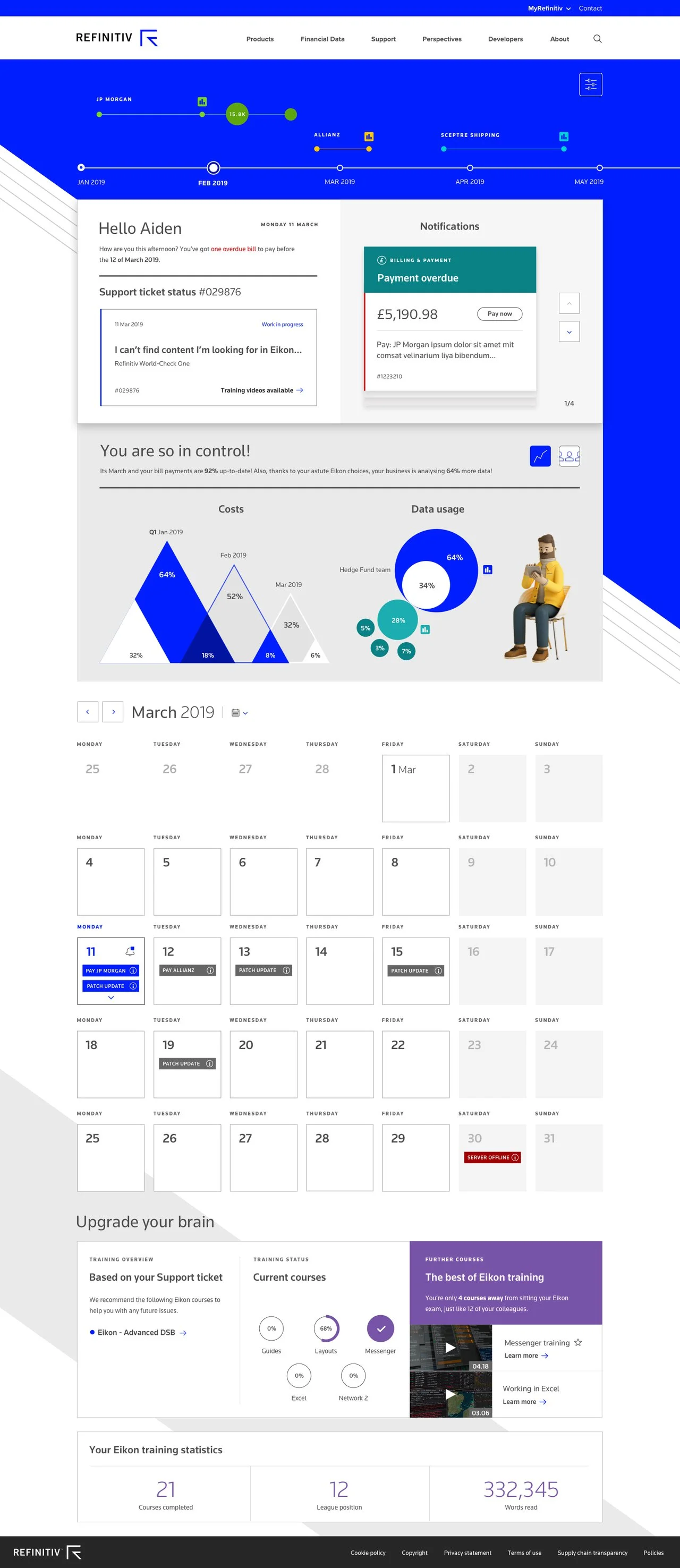
New Dashboard
Each section was carefully considered and crafted to provide a short-cut overview of; activities, notifications and useful/interesting content. New elements included; taking graphical shapes used in marketing and applying them as a visual element to break up the current design’s static/box-heavy design. Personality in the form of characters, to either represent a customer or give the brand personality. Data visualisation does not exist and yet utilising data in a way to convey information did not exist in Refinitiv's design language palette.
Old Dashboard
New and existing users struggled to use/didn’t use the existing dashboard. It had only the basic amount of personalisation, didn’t know its use base, didn’t offer insights or suggestions and had very little in the way of notifications
New Dashboard design, infographic panel
In the previous new UI screen, we envisaged an overlay that uses customer data to provide performance feedback, to help users understand how well they’re performing and make improvements as well. The screen below shows the Admin how well their team has done thanks to the Refinitiv product data they've shared. Using data in this way has not been considered by the business previously.
Conclusion + Results
As an exploratory project, this served to identify many areas missing from the old design. Namely; it wasn’t serving user needs well at all. The new design did more than just display data, it helped to improve comprehension, proactively provided information that would help productivity by understanding what the user was doing and needed.